Printed Programme or Wall Poster: Two Ways to Meet a Film
See how a printed film programme and a wall poster shape attention differently, and choose the format that best preserves the kind of encounter you value.
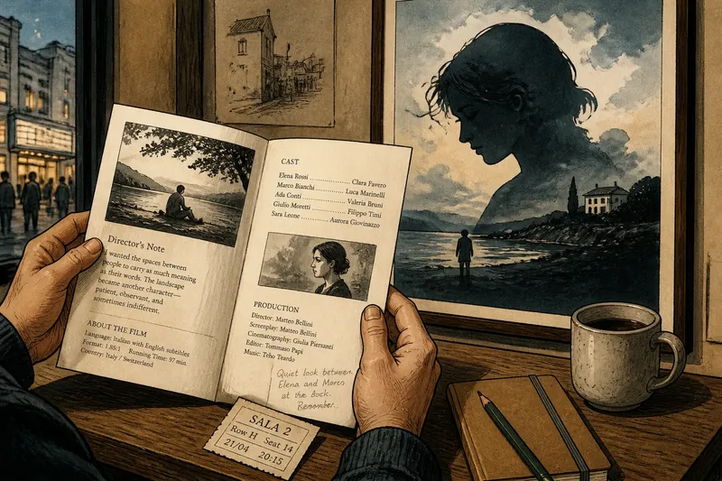
A printed film programme lets you linger with a movie; a wall poster asks for a glance. That difference is not simply a matter of size or convenience: each object frames the film before you see it, and each leaves a different kind of memory afterward.
Look at the two side by side and the contrast becomes vivid. A programme can hold a director’s note, a cast list, a still, and the texture of paper in your hands. A poster has to make its case from across a room, often with one image, a title, and a few lines of text. Neither is the film itself, but both teach you how to approach it.
What does a programme invite you to notice?
A programme is a small reading space. Its folded pages reward a viewer who wants context at a chosen pace: a paragraph before the screening, a glance at the cast during the credits, or a second look at a production still on the ride home. That private rhythm makes the object feel less like an announcement and more like a companion.
Its most useful details are often modest. A listing of performers can help you recognize a face you missed in the dim room. A note about the film’s language or format can prepare you for a different viewing experience without telling you what to think. Even the order of the pages can suggest a path through the material, from practical information toward interpretation.
But a programme’s closeness has a limit. It is easy to read every note as a key to the film, even when the most compelling thing about a scene is its uncertainty. A good habit is to treat the printed text as a set of invitations, not instructions. Read what interests you, then let the screening complicate it.
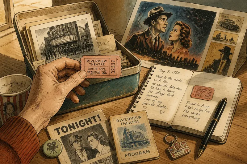
For a viewer who likes to carry a trace of the evening, the programme also offers a tactile record. A crease, a faint pencil mark, or a ticket tucked inside can bring back where you sat and what caught your attention. Those marks matter because they connect the film to a particular act of looking, not because they make the paper more valuable.
Why does a poster work from a distance?
A poster has a public job. It must register in a corridor, storefront, or theater entrance while people are moving past it. Large shapes, strong contrast, and a readable title can do more in that setting than a block of carefully written context. The poster’s first success is simply to make someone pause.
That quick impression comes from selection. A face may dominate the composition; an empty landscape may imply scale; a single object may make the film feel mysterious or comic. The image is not a neutral summary. It chooses one emotional doorway and leaves the rest of the film outside the frame.
Posters also share space with their surroundings. A design seen above a ticket counter feels different from the same image on a narrow street wall or in a crowded festival hallway. Light, distance, neighboring signs, and the viewer’s pace all affect what can be noticed. The poster is therefore a meeting between image and place, not just a printed rectangle.
That public quality can make a poster feel more certain than the film. Its title and image arrive as a finished statement, while a movie unfolds through shifting scenes and tones. If the poster promises a particular mood, the screening may fulfill it, resist it, or turn it inside out. That gap is part of the format’s interest.
Which format suits the kind of encounter you want?
Choose a programme when you want context you can revisit. It suits screenings where the director’s note, a short essay, or carefully selected stills add texture without replacing the movie. It also works well when you want a keepsake that can sit on a desk or slip into a book rather than occupy a wall.
Choose a poster when the image itself is what you want to live with. A poster can bring a film’s visual language into a room and can be legible at a glance, even to someone who has not seen the movie. It makes a stronger display object, but the image’s scale and colors should fit the space where it will be seen.
Say you have just watched a quiet, dialogue-heavy film and want to remember both its ideas and a particular performance. You might keep the programme open to its cast page, then use a small note in the margin to record the scene you want to revisit. If instead the film’s stark silhouette keeps returning to mind, you might choose a poster that gives that image room on a wall. In either case, the choice follows the memory you want to keep, rather than a rule about which object is superior.
There is also a useful middle ground: read the programme first, then notice how the poster has simplified or redirected its language. A page may describe a film through its setting, while the poster centers a face. That difference can show how a film is presented to attentive readers and to passersby. The comparison is especially satisfying when both objects are available at a repertory screening or film festival.
How can you read their design without overreading it?
Start with what is visibly there. In a programme, notice the hierarchy: what appears on the cover, what earns a full paragraph, and what is reduced to a line of credits. On a poster, look at the image’s focal point, the title’s size, and the way empty space directs your eye. These are observable choices, not proof of what the makers intended.
Then ask what each format leaves out. A programme may make room for names and context but have no space for the texture of a moving scene. A poster may preserve a striking image but tell you almost nothing about the film’s rhythm or shifting point of view. The omission is not necessarily a flaw; it is part of the object’s particular way of meeting an audience.
For a practical comparison, place the programme and poster where you can see them together, perhaps on a table beneath a framed print. Note one detail each format emphasizes and one it cannot show. You might find that the programme makes a supporting character newly memorable while the poster captures the film’s atmosphere. Keep the observation specific; broad claims about a film’s “message” can quickly outrun what the objects actually reveal.
Typography deserves attention, too. A compact typeface on a programme may signal that the object expects close reading, while a large title on a poster has to survive a hurried glance. The paper, printing, and folds matter as well: a creased programme invites handling, while a glossy poster can catch reflections near a window. These material choices shape how the object is used before they shape how it is interpreted.
What should you ask about programmes and posters?
Is a film programme the same as a pamphlet?
The terms can overlap, but “programme” usually points to material tied to a screening or event, such as a schedule, credits, notes, and images. A pamphlet can serve a broader informational purpose, so check what the publication actually contains rather than relying on its label.
Should I read the programme before the screening?
That depends on how much context you enjoy having in advance. A brief note or cast list can orient you, while a detailed essay may shape your expectations; you can also save the longer reading for afterward.
Why do film posters often use images that are not literal scenes?
A poster condenses a film into an image that can catch attention and suggest tone quickly. A symbolic object, an unusual crop, or a striking arrangement can communicate an atmosphere without claiming to reproduce a specific moment.
Which one makes the better keepsake?
The better keepsake is the one that recalls the part of the encounter you want to hold onto. A programme suits notes and details you may revisit, while a poster suits an image you want to see in the room.
How do you keep each object useful?
Let a programme remain readable. Store it flat or folded along its existing creases, and keep it away from damp surfaces, direct sunlight, and loose food or drink. If you want to annotate it, use a light pencil mark in a margin rather than writing over a photograph or someone else’s printed text.
A poster benefits from a display choice that respects its design. A crowded wall can swallow delicate lettering, while a narrow frame can make a wide composition feel cramped. Before hanging it, check whether the poster’s strongest feature is meant to be seen from across the room or at close range, and place it accordingly.
For either format, keep the object’s purpose in view. A programme is not improved by being treated like a rare artifact if what you value is its readable note or marked page. A poster does not need to dominate a room to preserve its image. Use the object in a way that keeps its particular strength accessible.
The distinction between a printed film programme and a wall poster is ultimately a distinction between kinds of attention. One gives you room to return, read, and annotate; the other concentrates its invitation into a public image. When you choose between them, ask what you want the film object to do next: help you think through the screening, or let one visual impression keep meeting your eye.